A well-done opening titleeven if it’s only ten seconds long with your name and the name of your YouTube clipcan do much to set a polished mood to your video.
The reverse is true as well. Create an amateurish-looking title sequence and your project is immediately off on the wrong foot with your viewers. So let’s take a brief look at what to do and what to avoid when it comes to video titling.
Learn From The Pros
In the film industry, there are two main approaches to titles. The James Bond movies and Alfred Hitchcock’s later films begin with stunning, expensive title sequences. In contrast, Woody Allen is famous for his clean and stark movie titles, which almost invariably feature nothing more than white text on a black background, which he began using as a reaction to those expensive Hollywood opening titles.
But of course prior to video-and in particular, modern-day video software-everything had to be painstakingly crafted by hand and assembled with an optical printer. While the minimalistic titles that Woody prefers can work fine with the right project, there’s no need to limit yourself to them. So let’s look at some simple, but creative techniques for better titles.
Match Point
Judging by what’s on YouTube, most video editing programs default to a sans-serif font such as Helvetica or Arial, with no outline or drop shadow. And it’s tough to get much duller than that. Title cards that look like this are often a dead giveaway of a newbie at work:

Between products such as Digital Juice’s stylish font collections and even the myriad of default fonts available for use with typical video software, there are seemingly infinite potential font choices. Ultimately, two main rules apply, which helps to narrow things down:
1. Make sure the font is readable on screen.
2. Make sure the font is thematically appropriate for the subject matter.
In Hollywood, a sensitive love story set in the 18th century will likely use a different title font than a hard-hitting war movie. Similarly, a wedding video should likely use different fontsat least for the actual title of the productionthan a film documenting kids pulling off gnarly skateboarding action. What would both of those productions look like with the wrong fonts? Probably like this:

The Rules of The Game
As with matching the title fonts to the subject matter, the audiences watching your videos have a lifetime of conditioning from watching movies and TV, and they bring with them informal rules about titles and compositions.

The project’s title is typically large and centered onscreen. The lower third of the screen (with or without a separate “Lower Third” anchoring graphic underneath the text) is useful for naming persons or locations. Reversing those conventions can lead to definite audience confusion about who and what they’re watching.
Speaking of shot composition, don’t forget to check credits against the safe area of the screen. This is less crucial for Internet video, where you often have control over how viewers will see the video. But the vagaries of broadcast television, not the least of which is the variable quality of televisions of the viewers at home, demand checking titles against the video safe area. Most video-editing programs will generate optional safe area reference lines that look like this:

There are typically two lines shown, Title Safe, and Action Safe. Action Safe is the wider of the two, and represents the theoretical limit of most consumer televisions’ overscan amount. Experienced TV camera operators are trained to avoid having any important action in these areas, for fear of having it cut off an older TV set. The Title Safe area is even smaller, and it helps to sure that a presentation on TV doesn’t appear with a title such as:

If there’s any chance your video might eventually wind up being viewed on a consumer television (as opposed to an embedded clip viewed on a computer monitor), it’s best to make sure the text in your main title sequence fit comfortably with the safe areas.
Fill ‘Er Up!
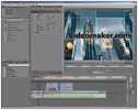
A surprisingly easy effect is to replace the color of the title text with either video images related to the theme, or an abstract animation. (It helps to use a thick font large enough so that the viewer will immediately notice the effect.) To do this in Premiere Pro, lay your title text on the top of the video tracks. Line up the video you want inserted as animated infill in the track underneath. Put your main video background at the bottom.
The whole sandwich should look like this:

Optional: As the above photo indicates, you can copy a second text layer synched to the top layer in the middle of this sandwich, if you want to preserve drop shadows and outer strokes:

Ordinarily, shadows and outer strokes will vanish from your text layer with the effect we’re about to insert:
In the effects controls of your video infill track, insert a Track Matte Key effect, and set its matte to the top text layer, and Composite Using to Matte Alpha.

And that’s pretty much all there is to it. Once you do this effect a few times, setting up the controls will become much simpler to do than the description above may seem at first.
Can I Take ’em to the Bridge?
Adobe’s After Effects program includes a number of preset animation templates available through the Adobe Bridge. These make it relatively easy to first select a font, then animate titles on and off the screen with a sophistication that would have taken days of hand-drawn animation and optical printer layering.

A little goes along way here. Animating the video’s main title in can give it tremendous punch. Animating in every credit in the production on and off screen will likely consume much more time than simply dissolving the text, and it also risks confusing the audience.
For those who are using a video editing application such as Premiere Pro rather than a graphics compositing program such as After Effects, it’s still possible to achieve to some limited animation effects, such as pushing the titles on and off-screen. Also, an effect such as Red Giant’s Knoll Light Factory is an easy way to add some motion and interest to an otherwise static title, sweeping a slick-looking light effect across a title with a few keystrokes.
Less Is More
With today’s editing and compositing programs, it’s possible to get way too crazy and chaotic with titles. But remember the aphorism associated with legendary modernist architect, Mies van der Rohe: less is more. When it doubt, keep things simple (but hopefully stylish!) so that your audience knows exactly what’s going on.
Ed Driscoll is an independent producer and freelance journalist covering home theater and the media.


